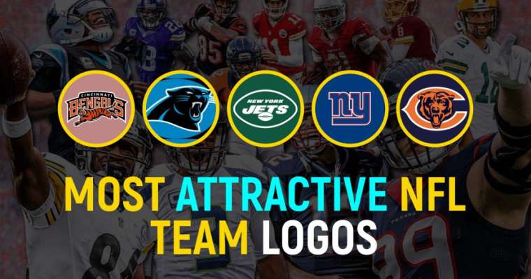
Top 10 Most Attractive NFL Team Logos Of All Time
September 17, 2021 By Sourav
The logo of any NFL team is the most recognizable feature. It is easy to recognize the iconic identifier, and fans know immediately which NFL team is being represented. Because of this reason, logos are an essential part of the identity of a team, and many fans across the world wear them on their t-shirts. Due to its significance, we've brought the most attractive NFL team logos of all time.
The National Football League has more than 32 teams, but most people recognize their teams by their logos rather than their names. In sports, very few organizations or teams have logos that are as iconic as the NFL logo.
For years, the NFL has retained this logo, also called the NFL shield. Since the current logo design was created in-house rather than by an external agency, only minor cosmetic changes have been made over the years.
Most Attractive NFL Team Logos | All-Time Ranking
10. Baltimore Ravens - Owings Mills, Maryland
9. Cleveland Browns - Berea, Ohio
8. New Orleans Saints - Metairie, Louisiana
7. Jacksonville Jaguars - Jacksonville, Florida
6. Indianapolis Colts - Indianapolis, Indiana
5. Chicago Bears - Chicago, Illinois
4. New York Giants - East Rutherford, New Jersey
3. New York Jets - East Rutherford, New Jersey
2. Carolina Panthers - Charlotte, North Carolina
1. Cincinnati Bengals - Cincinnati, Ohio
Don’t Miss
• Best NFL Team Logos | Infographics
• FAQs Regarding Best NFL Team Logos
American Football is not just one of the most popular sports in the USA but also one of the richest sports in the world. And its prime competition, NFL, is also equally popular.
Several teams out there add some extra features annually or seasonally, but most of them keep their previous logos. Change is good, but teams who are unwilling to change their logo are afraid to lose their distinctive identity. That is why most teams have the old logo looks more attractive than those who add features with time. So, let's start to unveil the top ten rankings of the best NFL logos.
10. Baltimore Ravens - Owings Mills, Maryland

Baltimore Ravens are members of the National Football League. Ravens are a member club of the American Football Conference North division of the National Football League. In addition to playing home games at M&T Bank Stadium, the team is based in Owings Mills, Maryland.
Because of its most attractive and alluring logo, the team Baltimore Ravens got 10th spot out of the most attractive NFL team logos ever. There's nothing quite like the Ravens primary logo with the mean-looking bird and nuts in its mouth.
However, the secondary logo appears to be more like a man with scattered hair. As part of Raven's logo, there is a wavy purple link beneath a gold shield, while the central element is a shield that honors Baltimore's heraldry.
Additionally, the Ravens' team logo features the aggressive head and features the letter "B." The official colors of the logo are yellow, purple, white, and black, and the bird represents insight and prophecy.
9. Cleveland Browns - Berea, Ohio

On number 9, we have ranked Cleveland Browns out of the most attractive NFL team logos of all time. Based in Cleveland, the Cleveland Browns are a professional American football team.
The team plays in the American Football Conference North Division as an American Football League club named for original coach and co-founder Paul Brown. It is now widely dubbed as one of the most successful NFL teams in the Super Bowl.
The Cleveland Browns logo consists of two interlocked letters, "CB" representing the city. Since its founding in 1946, Cleveland has had eight logos, six of them on helmets. Cleveland's logo features a little funny character called Brownie Elf, and the font used is NFL Brown.
Additionally, the Cleveland club's official colors are orange and brown, which highlight the club's strength and toughness. In recent news, Cleveland revealed new changes to their logo and chose an orange color and a brown facemask.
8. New Orleans Saints - Metairie, Louisiana
Located in New Orleans, the New Orleans Saints are a professional American football team. The Saints represent the National Football Conference South division in the National Football League.
Due to its most attractive logo In NFL history, Orleans Saints got 8th position out of top then teams who have the best logos out there. On a different note, it is the home of several of the most popular American football players.
The Saints logo, also known as "fleur de lis," has remained the same since 1967 except for minor modifications. Despite the many logos Saints have, each has unique places and special memories with the club and fans. The combination of the black logo against the gold backdrop of the Saints helmet is stunning and unique.
There is no significant difference between the old and recent sketches, other than a light gold hue. Furthermore, its official colors are gold, white, and black, which stand for royalty, peace, and justice.
7. Jacksonville Jaguars - Jacksonville, Florida

We've ranked Jacksonville Jaguars on the 7th spot out of the best NFL team logos of all time. In Jacksonville, Florida, there is a professional football franchise called the Jacksonville Jaguars.
It is based in Florida, one of the American cities with most sports franchises. As a member club of the American Football Conference South, the Jaguars compete in the National Football League. At the TIAA Bank Field, the team plays their home games.
The Jaguars logo consists of a gold jaguar head with a black pattern on jaguar skin. The logo's colors are black, gold, teal, and white, which resemble the natural colors of the Jaguar that is the logo's key symbol. With some changes, the Jaguars logo now appears fiercer and more realistic.
Comparing all NFL logos of cats and horseshoes, the Jaguar has the strange one featuring the most powerful animal whose head is full of black spots. Over the years of their existence, the Jaguars have just two strong and distinguishable logos.
6. Indianapolis Colts - Indianapolis, Indiana

Indianapolis is home to the Indianapolis Colts, an American football team. As a member club of the American Football Conference South division, the Colts compete in the National Football League.
Colts’ games have been played at Lucas Oil Stadium since 2008. Indianapolis Colts got 6th spot out of top 10 NFL fantasy logos. The Indianapolis Colts logo is unique since it has a horseshoe design that is very old and plain.
The plain horseshoe style was introduced in 1979 and has remained our most iconic mark, also loved by NFL players and football fans. The Colts logo has seven white grommets that add an extra touch of elegance.
Along with its majestic appearance, the Colts logo also honors and enriches Indiana's history. For the Colts, the horseshoe represents determination and success. The official colors of the Colts logo, blue and white, emphasize the excellent strength and integrity of the club.
5. Chicago Bears - Chicago, Illinois

On number five, we have ranked Chicago Bears out of the most attractive NFL team logos of all time. An American football team based in Chicago, the Chicago Bears. The Bears are members of the National Football Conference North division in the National Football League.
The Chicago Bears logo is an iconic sketch among NFL draft logos with the big "C" that the team has used since the 1960s. The logo's official colors are orange, white, and blue, as you can see from its composition.
Although this spectacular logo resembles the Cincinnati Reds logo, fans found it unappealing when they noticed it. The wishbone style of the "C" represents energy, enthusiasm, and good fortune, and the bear represents power and compactness in the logo.
The bold and simple-looking "C" represents the iconic strong values and rules of the club. Till now, the Chicago Bears are using the same logo as their official franchise representation.
4. New York Giants - East Rutherford, New Jersey

The cool NFL logo of the New York Giants got 4th spot out of the most popular NFL team logos of all time. The New York Giants are a professional American football team based in New York City.
The Giants are members of the National Football Conference East division of the National Football League. Besides, it is the home of many of the highest-paid American Football players in the world right now.
From the style of the player throwing a football to the simple iconic sketch of two letters NFL "NY" giant logo in the current logo, the New York Giants have undergone many changes. In place of the previous lowercase 'NY,' the newly revised style became the primary logo.
Aside from that, the New York logo is magnificent because it represents the fashion sense of the city with simplicity, whereas the logo that indicates the city's name is more popular. It is known that the New York Giants, since their establishment in 1925, have had various uniforms and logos, but their most recent style is the most majestic.
3. New York Jets - East Rutherford, New Jersey

Out of the top 10 most attractive logos of all time, we've ranked New York jets on 3rd spot. A professional American football team based in the New York metropolitan area, the New York Jets.
The Jets represent the American Football Conference East division in the National Football League. During the redesign, the Jets introduced the NFL pride logo with the letters "NY" in the background.
The Kelly-green background has been changed to forest green. In comparison with Jets' ancestor logos, the most recent design is more elegant and streamlined. Further, it includes the club’s name and the outline of a football at the bottom.
As the logo's official colors, green and white represent the team's characteristics and highlight its aspiration, novelty, and positivity. Over the history of the team, the logo styles have changed many times, but the color combination has remained the same.
2. Carolina Panthers - Charlotte, North Carolina

Carolina Panthers is a professional American football team based in Charlotte, North Carolina. As a member club of the National Football Conference South division, the Panthers are part of the National Football League.
Carolina Panthers has the most attractive logo in history; therefore, the team got 2nd spot out of the best NFL team logos of all time. The logo is specifically designed to mimic the merged outlines of North and South Carolina.
In addition, his ferocious beast was made more ferocious by adding additional aggression. Their big yawning cat is well defined through simple lines and colors, representing the team's strength and ambition to master all their performances.
During the 2012 season, the Panthers changed their logo and removed the teal color on top of black, replacing it with a deeper shade of blue over the black logo.
1. Cincinnati Bengals - Cincinnati, Ohio

In the first place, we've ranked Cincinnati Bengals out of the top 10 most attractive NFL team logos of all time. Cincinnati Bengals are a professional American football team based in Cincinnati.
As a member club of the American Football Conference North division, the Bengals compete in the National Football League. Paul Brown Stadium, one of the most expensive NFL stadiums, is located in downtown Cincinnati and serves as the club's home stadium.
Bengal’s logo has undergone many changes over time, but the tiger theme is consistent in all the redesigns. To make their logo more spectacular, they used a bold "B" with a darker shade of orange. Considering the logo's shape of a sharp "B" covered with three tiger stripes, the sketch highlights the compactness, and the famous tiger pattern reflects the power and energy.
Additionally, the Bengals' "B" is also featured on the jerseys, but the helmets still have tiger stripes, and that is not going to change this year.
Conclusion
That's all, folks! There is more to logos than just the tags that represent a team, but they also serve an important function. The logos are also intended to communicate a message to the world while using specific colors, which signify peace, respect, and even love.
The articles and rankings we wrote are intended to make you happy and satisfied. In the comment box below, let us know whether we missed any other team logos or ranked some other logos differently.
Best NFL Team Logos | Infographics

FAQs Regarding Best NFL Team Logos
Q. Which NFL team does not have a logo on their helmet?
The Cleveland Browns wear orange helmets without any logo on them. The orange helmet has become their logo over the years, and they are the only team on this NFL quiz without some kind of symbol.
Q. What do the eight stars on the NFL's league logo mean?
Each of the eight stars represents one of the eight divisions used in the NFL. There is also a reason for changing the football on the NFL logo. A new logo for the NFL was designed to replicate the ball atop the Vince Lombardi Trophy.
Q. Why do the Carolina Panthers have the NFL logo?
As an expression of gratitude for the NFL's acceptance of the Panthers as a franchise in 1993, founder Jerry Richardson traditionally deferred the midfield logo to an image of the NFL shield.
Q. What does the G of the US NFL football Green Bay Packers logo stand for?
Despite the fact that everyone assumes the oval logo represents "Green Bay," the G actually stands for "Greatness." A trademark has been obtained by the Packers for the logo created by equipment manager George Braisher in 1961.
More Recent Posts

Sports Betting Term Glossary

The Impact of Casinos on Sports: How Gambling is Changing the Way We Watch Sports

What the start of the NBA pre-season can show Basketball fans

Top Riders' Effects on Horse Racing

How To Germinate Feminized Seeds

Blue Chip Online Casino: The Best Way to Enjoy Your Favorite Casino Games Online
Leave a Reply