Top 10 Best NBA Logos Of All Time
September 21, 2021 By Sourav
As many clubs have changed or modified their logos to improve their image over the past decade, many have attempted to modernize into the best NBA logos of all time.
From the technicolor dreams of the '70s to today's post-postmodern logo, the NBA has tried to keep up with new trends when it comes to team logos.
A number of redesigns have occurred; some have been successful, others have failed; one team even kept the classic design since day one. So, let’s find the best NBA Team logos that every fan loves.
Best NBA Logos | All-Time Ranking
10. Philadelphia 76ers - Philadelphia, Pennsylvania
9. Atlanta Hawks - Atlanta, Georgia
8. New Orleans Pelicans - New Orleans, Louisiana
7. Chicago Bulls - Chicago, Illinois
6. Golden State Warriors - San Francisco, California
5. Boston Celtics - Boston, Massachusetts
4. Charlotte Hornets - Charlotte, North Carolina
3. Toronto Raptors - Toronto, Ontario
2. Miami Heat - Miami, Florida
1. Milwaukee Bucks - Milwaukee, Wisconsin
Don’t Miss
• Best NBA Logos In The World | Infographics
• FAQs Regarding Best NBA Team Logos
Basketball is one of the most popular sports in the world. And its prime competition, NBA, is the home of some of the highest-paid athletes of this year. This tournament has witnessed several of the best logos that we are now going to reveal.
10. Philadelphia 76ers - Philadelphia, Pennsylvania

An American professional basketball team based in Philadelphia, the 76ers play in the National Basketball Association. Playing at the Wells Fargo Center, the 76ers are members of the Eastern Conference Atlantic Division of the NBA. They are now widely regarded as one of the best NBA teams of all time.
The Philadelphia 76ers logo is one of the top 10 best NBA logos of all time. Seven logos have been changed in the club's history, and finally, it got its ideal logo in 2015. The new valiant and smooth logo was designed by Mel Richman.
It consists of primary colors red, blue, and white that reflect the club's patriotism towards the country because these are the colors of the flag of the country.
The recent logo, also known as the Sixers, is redesigned stylistically with the red figure “7” that looks spectacular with the 13 stars on the head denoting the 13 American colonies.
9. Atlanta Hawks - Atlanta, Georgia

Based in Atlanta, the Atlanta Hawks are an American professional basketball team. As members of the Eastern Conference's Southeast Division, the Hawks belong to the National Basketball Association. All of the team's home games take place at State Farm Arena.
The Atlanta Hawks logo is also considered one of the top 10 best logos and ranked at 9th place. Throughout its history, the club has changed the logo 12 times and finally settled on the iconic design by Ted Burn in 2020.
Home of some of the richest NBA players, Hawks has the significance of their logo. The red and white colors are the primary colors of Atlanta's logo, and the darker red color represents the club as stronger and dangerous.
Moreover, the red bird's head is encircled with double white and red outlines that make it more significant, and the capitalized letters around the bird's head give its logo a professional look.
8. New Orleans Pelicans - New Orleans, Louisiana

The New Orleans Pelicans are a professional basketball team in the United States. The New Orleans Pelicans are part of the league's Southwest Division in the West Conference. A home game for the team happens at Smoothie King Center. On a different note, they have always housed some of the most handsome NBA players of all time.
The Pelicans team has one of the best NBA logos of all time with the unique style of an animal whose massive beak and aggressive eyes grab the attention directly to the middle of the logo's sketch.
The club underwent the changes four times to get the best version of the logo, and finally, they got the perfectly designed logo by the designer Addison Foote in 2014.
Looking at the sketch of the logo, we can say that the design represents Louisiana's state and is present on its seal and the state flag. Besides, the New Orleans Pelicans logo has red, navy, and gold colors as its official colors representing the patriotism and the bright future of the club.
7. Chicago Bulls - Chicago, Illinois

Located in Chicago, the Chicago Bulls are an American professional basketball team. In the National Basketball Association, the Bulls are part of the league's Central Division for the Eastern Conference.
In the 1966–67 NBA season, the team played its first game on January 16, 1966. And since then, this NBA side has remained home for many greatest basketball players of all time.
The Chicago Bulls logo got the 7th spot out of the top ten best NBA logos of all time. Considering the sketch of the logo, the emblem of the Chicago Bulls is the head of an aggressive red bull whose face represents the club. This unique, fierce style was designed by the Graphic designer Dean Wessel in 1966 and is still used today.
The red, white, and black are the official colors of this iconic logo; the red color on the tips of the horns denotes the blood spots that show the incredible aggression of the team to compete against the opponent.
6. Golden State Warriors - San Francisco, California

Founded in San Francisco, the Golden State Warriors are a professional basketball team in the United States. NBA team, competing in the Western Conference Pacific Division of the league.
The Golden State Warriors logo has ranked the 6th spot in the top 10 best NBA logos of all time, with style focusing on the details of the bridge that denotes the connection between San Francisco Bay and Oakland.
The club underwent alternations 11 times to get the perfectly designed logo, and after many trials, they found the best iconic logo designed by the logo designer Dalius Stuoka in 2019.
The Warriors logo's official colors include royal blue and yellow, blue for the circle, and yellow for the Golden bridge design. On a lighter note, this club has always hosted some of the tallest NBA players of all time.
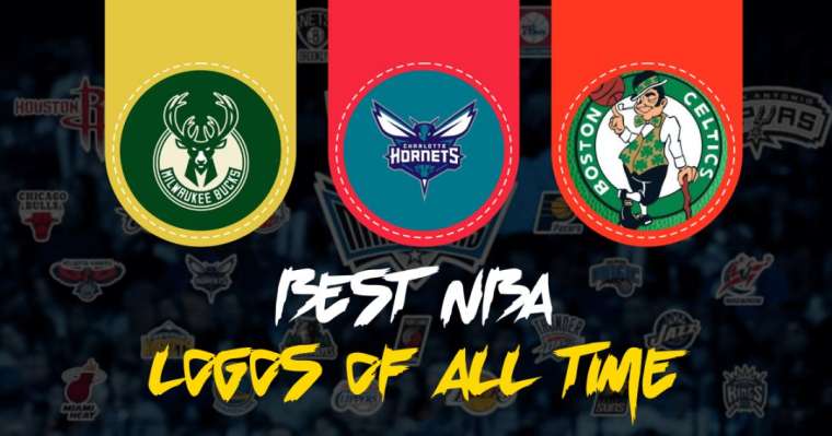
5. Boston Celtics - Boston, Massachusetts

The basketball team Boston Celtics is based in Boston, Massachusetts. Celtics are a member of the Eastern Conference Atlantic Division of the National Basketball Association. This club is known for drafting some of the greatest college basketball players since the inaugural season of the NBA.
The Boston Celtics logo got the 5th position out of the top 10 best NBA logos of all time. To get the best iconic logo style, the club changed its logo six times and finally found the perfect one designed by the Red Auerbach's brother Zang in the early 1950s.
The Boston Celtics logo is known to have many colors, featuring a cheerful guy with the pipe projecting from the right corner of his mouth. Although green, white, and black are the logo's primary colors, but other colors like brick red, yellow straw, and beige are constantly changing.
Considering its design, the creative and cheerful style of the logo represents the optimism, positivity, and determination of the team.
4. Charlotte Hornets - Charlotte, North Carolina

North Carolina-based Charlotte Hornets are a professional basketball team from the United States. As a member of the National Basketball Association's Eastern Conference Southeast Division, the Hornets compete in the league. They are also the reason for making basketball one of the most popular sports in the USA.
The Charlotte Hornets logo is considered as 4th best logo in the list of the top 10 best logos of NBA history. The club changed the logo five times to get the ideal logo for the team, and finally, they found the best design in 2014, designed by a Turkish designer Eren G.
The recent Hornets iconic logo contains the four primary colors, teal, dark purple, grey and white, with the nameplate placed in the center of the logo's sketch. The capitalized letters of the name give it a professional look with the wings spread to the sides.
Moreover, the primary logo with the purple and teal colors features the aggressive-looking hornet that is ready to defeat the opponent.
3. Toronto Raptors - Toronto, Ontario

Founded in Toronto in 1985, the Toronto Raptors are a Canadian professional basketball team. Raptors are a member of the Eastern Conference Atlantic Division of the National Basketball Association.
The Toronto Raptors logo ranked 3rd in the list of the top 10 best NBA logos of all time due to its unique design featuring the dinosaur theme that was disappeared in the new versions of the logo.
Furthermore, to found the best version of the logo, the club underwent alternations four times, and at last, they became satisfied with the new version designed by Sid Lee of Entrant Company.
The Raptors logo's official colors are red, black, silver, and gold. The recent logo of the Raptors is known to have two main components; the basketball and the capitalized letters encircling the basketball that make it more eye-catching and professional.
2. Miami Heat - Miami, Florida

Miami Heat is an American professional basketball team based in Miami, one of the American cities with the highest sports franchises. In the National Basketball Association, the Heat belongs to the Eastern Conference Southeast Division. FTX Arena is the club's home arena, and it has won three NBA championships.
Miami Heat logo is on the top 2nd spot in the list of the top ten best logos of NBA history. The Miami Heat club got its iconic logo designed by Addison Foote in 1999 after inducing some changes in the old logo.
Moreover, the recent version of the Miami Heat logo featured just a graphical design without any context below it. Considering its sketch, the logo contains a basketball going through a black hoop with a distinctive design on the horizontal bar that represents the flame.
The Miami logo's official colors are red, orange, black, and white and these colors and these colors symbolize the passion, youthfulness, dominance, and supremacy of the team, respectively.
1. Milwaukee Bucks - Milwaukee, Wisconsin

The Milwaukee Bucks are a professional basketball team from Milwaukee, Wisconsin. National Basketball Association member team Bucks belong to the Eastern Conference Central Division. The team's expansion began in 1968, and it plays at the Fiserv Forum, one of the best NBA arenas right now.
The Milwaukee Bucks logo design is ranked first place out of the top ten best logos of NBA history. The most basic design of Milwaukee's primary logo is enhanced four times to get the best version that is still in used today.
Designing the logo for the Milwaukee Bucks D and C worked with a large number of partners like Nike and Red Bull, but the Bucks design is considered as the firm's biggest contribution in 2015. The Milwaukee logo's primary colors are green, purple, and silver.
While looking at the logo's sketch, we can say that the buck is really symbolizing aggressiveness and determination with the frontal view of the head and shoulders.
Conclusion
That all, folks! We hope you liked reading our article and rankings. If you have any questions regarding our ranking or article, please feel free to ask us in the comment section below. You can even send us an Email. We will appreciate your effort.
Best NBA Logos In The World | Infographics

FAQs Regarding Best NBA Team Logos
Q. How to draw the NBA logo?
Nowadays, drawing a logo is not a big deal. One who knows photoshop or any other software can draw anything and any kind of logo, using any best software.
Q. Is the NBA changes its logo?
Yes, NBA has changed its logo. There have been numerous changes that happened in the past, but after 1969 NBA has not changed its logo till now.�
Q. Who is on the NBA logos in 2021?
In retrospect, NBA has represented the Ball with its official name on it, The Basketball. But now it has a player running to goal, holding a ball in his hand with the red, blue, and white color.�
Q. Who is on the NBA logo?
The NBA logo has changed its colors from 1950 to 1962 into different designs and fonts with various colors. However, after 1969, NBA has agreed on a single logo. It never changed even its colors.
More Recent Posts

Sports Betting Term Glossary

The Impact of Casinos on Sports: How Gambling is Changing the Way We Watch Sports

What the start of the NBA pre-season can show Basketball fans

Top Riders' Effects on Horse Racing

How To Germinate Feminized Seeds

Blue Chip Online Casino: The Best Way to Enjoy Your Favorite Casino Games Online
Leave a Reply